


H
ello guys. How are you all? I hope you are all well. I came again with a post. Let’s go..


তো এই পোস্ট যে কেড শেয়ার করবো তা হলো Typing indicator। যা Chating based service এ ব্যবহার হয়, আপনি চাইলে এটি আপনার ইচ্ছে মতো ব্যবহার করতে পারেন।
তো প্রশ্ন হতে পারে যে Typing indicator কি? তো সব বুঝিয়ে দিচ্ছি।
Typing Indicator কি?


Typing Indicator হল একটি ডিজিটাল ফিচার যা রিয়েল-টাইম কমিউনিকেশন প্ল্যাটফর্মে (যেমন মেসেজিং অ্যাপ, চ্যাট সিস্টেম, ইমেল ক্লায়েন্ট ইত্যাদি) ব্যবহৃত হয়। এটি ব্যবহারকারীকে জানায় যে অন্য পক্ষ বর্তমানে মেসেজ টাইপ করছে। এই ফিচারটি সাধারণত একটি অ্যানিমেটেড আইকন বা টেক্সট দ্বারা প্রদর্শিত হয়, যেমন “অমুক টাইপ করছে…”।
কিভাবে কাজ করে:
- ইনপুট ডিটেকশন: যখন একজন ব্যবহারকারী মেসেজ টাইপ করা শুরু করে, সিস্টেম তা ডিটেক্ট করে।
- নোটিফিকেশন পাঠানো: সিস্টেম অপর পক্ষকে একটি নোটিফিকেশন পাঠায়, যা টাইপিং ইন্ডিকেটর হিসেবে প্রদর্শিত হয়।
- স্টপ সিগন্যাল: যদি ব্যবহারকারী টাইপিং বন্ধ করে বা মেসেজ পাঠায়, সিস্টেম টাইপিং ইন্ডিকেটর বন্ধ করে দেয়।
উদাহরণ:
- WhatsApp: “অমুক টাইপ করছে…” দেখা যায়।
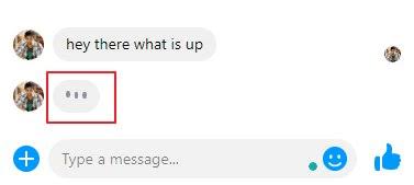
- Facebook Messenger: একটি ছোট ডট বা “অমুক টাইপ করছে…” দেখা যায়।
- Slack: “অমুক টাইপ করছে…” দেখা যায়।
গুরুত্ব:
- রিয়েল-টাইম ফিডব্যাক: ব্যবহারকারী জানতে পারে যে অন্য পক্ষ সক্রিয় এবং মেসেজ টাইপ করছে।
- কমিউনিকেশন ইমপ্রুভ: অপেক্ষার সময় কমে এবং কথোপকথন আরও ফ্লুইড হয়।
- ইউজার এক্সপেরিয়েন্স: ইন্টারঅ্যাকশন আরও ইন্টুইটিভ এবং এনগেজিং হয়।
আশা করি বুঝতে পারছেন। আমি এখানে দুটি Typing Indicator এর কোড দিবো যার মধ্যে একটি Facebook এর আর একটি Random তো এখন কোড শেয়ার করা যাক —
Facebook Typing indicator code
<style>
.tiblock {
    align-items: center;
    display: flex;
    height: 17px;
}

.ticontainer .tidot {
    background-color: #90949c;
}

.tidot {
    -webkit-animation: mercuryTypingAnimation 1.5s infinite ease-in-out;
    border-radius: 2px;
    display: inline-block;
    height: 4px;
    margin-right: 2px;
    width: 4px;
}

@-webkit-keyframes mercuryTypingAnimation{
0%{
  -webkit-transform:translateY(0px)
}
28%{
  -webkit-transform:translateY(-5px)
}
44%{
  -webkit-transform:translateY(0px)
}
}

.tidot:nth-child(1){
-webkit-animation-delay:200ms;
}
.tidot:nth-child(2){
-webkit-animation-delay:300ms;
}
.tidot:nth-child(3){
-webkit-animation-delay:400ms;
}</style>
<div class="ticontainer">
  <div class="tiblock">
    <div class="tidot"></div>
    <div class="tidot"></div>
    <div class="tidot"></div>
  </div>
</div>
iMessage Typing Indicator
<style>.typing-indicator {
  $ti-color-bg: #E6E7ED;
  background-color: $ti-color-bg;
  will-change: transform;
  width: auto;
  border-radius: 50px;
  padding: 20px;
  display: table;
  margin: 0 auto;
  position: relative;
  animation: 2s bulge infinite ease-out;
  &::before,
  &::after {
    content: '';
    position: absolute;
    bottom: -2px;
    left: -2px;
    height: 20px;
    width: 20px;
    border-radius: 50%;
    background-color: $ti-color-bg;
  }
  &::after {
    height: 10px;
    width: 10px;
    left: -10px;
    bottom: -10px;
  }
  span {
    height: 15px;
    width: 15px;
    float: left;
    margin: 0 1px;
    background-color: #9E9EA1;
    display: block;
    border-radius: 50%;
    opacity: 0.4;
    @for $i from 1 through 3 {
      &:nth-of-type(#{$i}) {
        animation: 1s blink infinite ($i * .3333s);
      }
    }
  }
}

@keyframes blink {
  50% {
    opacity: 1;
  }
}

@keyframes bulge {
  50% {
    transform: scale(1.05);
  }
}

// vertically center demo
html {
  display: table;
  height: 100%;
  width: 100%;
}

body {
  display: table-cell;
  vertical-align: middle;
}</style>

<div class="typing-indicator">
  <span></span>
  <span></span>
  <span></span>
</div>
S
o friends, that’s it for today. See you in another post. If you like the post then like and comment. Stay tuned to Trickbd.com for any updates.