
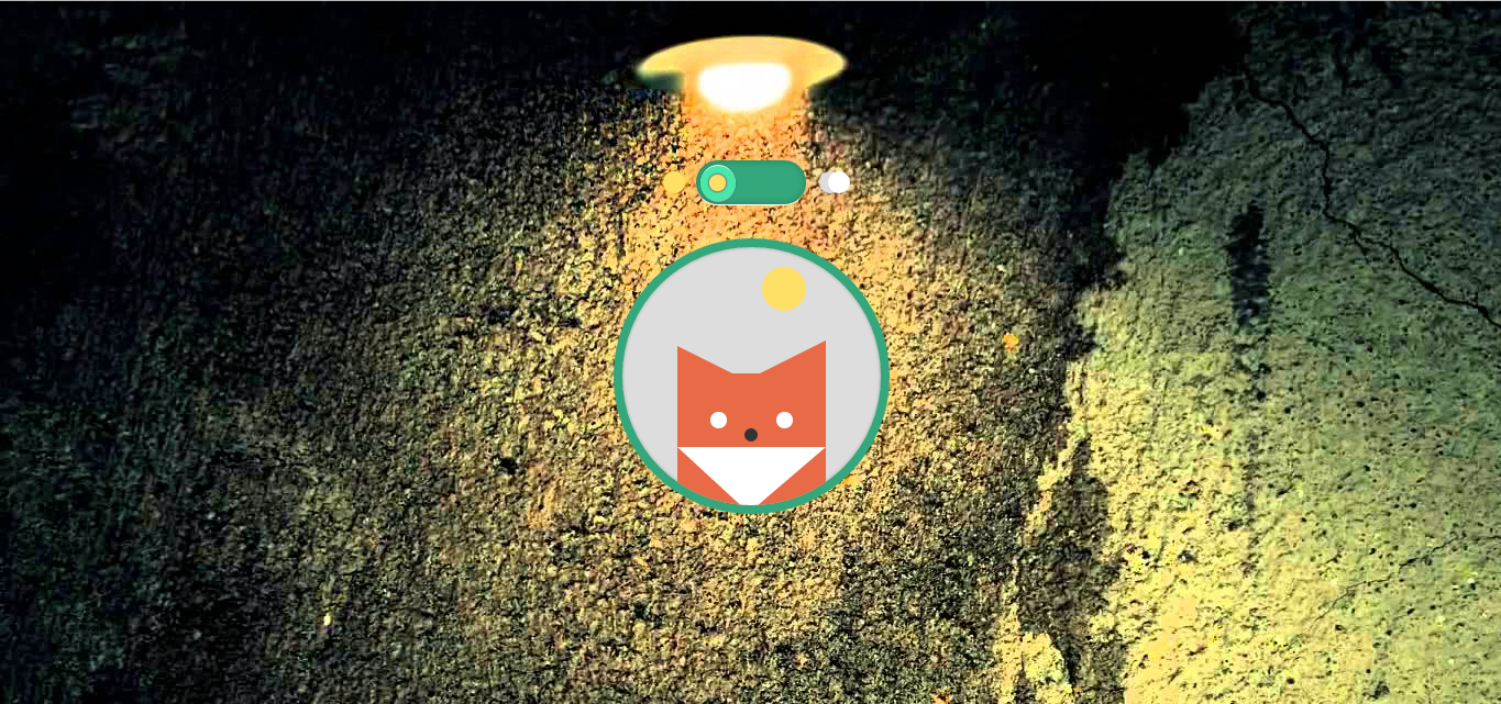
এই কোডটি দিয়ে আপনি Day এবং Night সিলেক্ট করতে পারবেন Switch এর মাধ্যমে যেখানে দেখা যাবে একটি শিয়াল ঘুমাছে Night Switch এ ক্লিক করলে আর অপরদিকে Day Switch এ ক্লিক করলে দেখা যাবে শিয়ালটি ঘুম থেকে উঠছে। আর মাউস আইকন শিয়ালের উপর ক্লিক করলে একটা হাসি দিচ্ছে শিয়ালটি।

প্রথমতঃ-
নিচের কোডটি আপনি আপনার সাইটের </body> ট্যাগ খুজে বের করে </body> ট্যাগটির উপরে পেস্ট করবেন।
CSS:
/* DAY STYLES*/
body{
  background: #FFF;
}
.the-container{
  display: block;
  position: absolute;
  width: 500px;
  height: 350px;
  margin: auto;
  top: 0;
  bottom: 0;
  left: 0;
  right: 0;
}
.c-window{
  display: block;
  position: relative;
  width: 235px;
  height: 235px;
  margin: 0 auto;
  border-radius: 100%;
  border: 8px solid #34A87C;
  background: #DDDDDD;
  box-shadow: 0px 0px 5px rgba(0,0,0,0.25) inset;
  overflow: hidden;
 transition: all .5s linear;
 -webkit-transition: all .5s linear;
}
.c-window .the-sun{
  display: block;
  position: relative;
  top: 18px;
  height: 40px; width: 40px;
  background: #FFE067;
  border-radius: 100%;
  margin: 0 auto;
  left: 30px;
}
.c-window .the-moon{
  position: relative;
  height: 24px; width: 24px;
  background: #EEE;
  border-radius: 100%;
  display:none;
}
.c-window .the-fox{
  display: block;
  position: absolute;
  bottom: -20px;
  height: 140px;
  width: 135px;
  margin: 0 50px;
  background: #E86A47;
  transition: bottom 1s;
 -webkit-transition: bottom .15s ease-in-out;
}
.c-window .the-fox:before{
   width: 0;
    height: 0;
    border-left: 0px solid transparent;
    border-right: 60px solid transparent;
    border-bottom: 30px solid #E86A47;
    top: -25px;
    left: 0;
    position: absolute;
    content: "";
}
.c-window .the-fox:after{
   width: 0;
    height: 0;
    border-right: 0px solid transparent;
    border-left: 60px solid transparent;
    border-bottom: 30px solid #E86A47;
    top: -30px;
    right: 0;
    position: absolute;
    content: "";
}
.c-window .the-fox:hover{
  bottom: -30px;
}
.c-window .the-fox .eyes{
   display: block;
  position: absolute;
  background: #FFFFFF;
  height: 15px; width: 15px;
  border-radius: 100%;
  bottom: 90px;
 -webkit-transition: all .15s linear;
}
.c-window .the-fox:hover .eyes{
  height: 2px;
 bottom: 97px;
}
.c-window .the-fox .eyes.left{
  left: 30px;
}
.c-window .the-fox .eyes.right{
  right: 30px;
}
.c-window .the-fox .nose{
   display: block;
  position: relative;
  background: #333;
  height: 12px; width: 12px;
  border-radius: 100%;
  margin: 0 auto;
  top: 50px;
}
.c-window .the-fox .white-part{
  display: block;
  position: relative;
  width: 0px;
height: 0px;
  top: 55px;
border-style: solid;
border-width: 60px 70px 0 65px;
border-color: #ffffff transparent transparent transparent;
}
input[type=checkbox] {
    position: absolute;
    visibility: hidden;
}
 input#toggle[type=checkbox]{
     display:none;
 }
label {
    position: absolute;
    height: 40px;
    width: 120px;
    display: block;
    top: 0px; bottom: 0; right: 0; left:0;
    z-index: 9999;
    cursor: pointer;
    margin: 0 auto;
}
.switch {
  display: block;
  position: relative;
  border-bottom: 1px solid #FFF;
  border-radius: 25px;
  background: #34A87C;
  box-shadow: inset 0 0 10px #888888;
  -webkit-box-shadow: inset 0 0 10px rgba(0,0,0,0.25);
  height: 40px;
  width: 100px;
  margin: 0px auto 30px auto;
}
.switch .button{
  display: block;
  position: absolute;
  border-top: 1px solid #FFF;
  border-bottom: 1px solid #AAA;
  border-radius: 100%;
  background: #48E8AA;
  height: 32px;
  width: 32px;
  top: 4px;
  left: 4px;
  box-shadow: 0 0 2px rgba(0,0,0,0.25)
}
.switch .button .b-inside{
  display: block;
  position: absolute;
  border: 1px solid #888;
  border-radius: 100%;
  background: #FFE067;
  height: 15px;
  width: 15px;
  top: 7px;
  left: 7px;
  box-shadow: 0 0 2px rgba(0,0,0,0.25)
}
.day-night-cont {
  display: block;
  position: absolute;
  width: 180px;
  margin: 0 auto;
  left: 0; right: 0; top: 0; bottom:0;
  height: 40px;
  top: 0px;
}
.day-night-cont .the-sun{
  display: block;
  position: absolute;
  left: 10px;
  top: 10px;
  height: 20px;
  width: 20px;
  border-radius: 100%;
  background: #FFE067;
  box-shadow: 0px 0px 10px #FFC41D;
}
.day-night-cont .the-moon {
  display: block;
  position: absolute;
  right: 8px;
  top: 10px;
  height: 20px;
  width: 20px;
  border-radius: 100%;
  background: #DDD;
  box-shadow: 0px 0px 50px #CCC;
}
.day-night-cont .the-moon .moon-inside{
  display: block;
  position: absolute;
  left: 8px;
  height: 20px;
  width: 20px;
  border-radius: 100%;
  background: #FFFFFF;
}
/* TOGGLE */
.switch .button {
    transition: left .25s ease-in-out;
    -webkit-transition: left .25s ease-in-out;
}
input[type=checkbox]:checked ~ .switch .button {
    position: absolute;
    left: 64px;
}
/* NIGHT ANIMATION */
input[type=checkbox]:checked ~ .c-window {
  background: #222222;
}
input[type=checkbox]:checked ~ .c-window .the-sun{  display: none; }
input[type=checkbox]:checked ~ .c-window .the-moon{
  display: block;
  position: absolute;
  margin: 0 auto;
  top: 40px;
  left: 60px;
}
input[type=checkbox]:checked ~ .c-window .the-fox{
  background: #C74628;
}
input[type=checkbox]:checked ~ .c-window .the-fox:before{
   width: 0;
    height: 0;
    border-left: 0px solid transparent;
    border-right: 60px solid transparent;
    border-bottom: 30px solid #C74628;
    top: -30px;
    left: 0;
    position: absolute;
    content: "";
}
input[type=checkbox]:checked ~ .c-window .the-fox:after{
   width: 0;
    height: 0;
    border-right: 0px solid transparent;
    border-left: 60px solid transparent;
    border-bottom: 30px solid #C74628;
    top: -30px;
    right: 0;
    position: absolute;
    content: "";
}
input[type=checkbox]:checked ~ .c-window .the-fox .eyes{
  height: 2px;
  bottom: 90px;
}
input[type=checkbox]:checked ~ .c-window .the-fox:hover .eyes{
  height: 15px;
  bottom: 85px;
}

আর নিচের কোডটি ব্যবহার করুন আপনার Html কোডের ভিতরে যেখানে আপনি ফাংশন দেখাতে চান সেখানে শুধু কোডটি পেস্ট করে দিবেন আর দেখুন মজা।
HTML:
<div class="the-container">
  Cyber Prince <input type="checkbox" id="toggle" />
  <label for="toggle"></label>
  <div class="day-night-cont">
      <span class="the-sun"></span>
      <div class="the-moon"><span class="moon-inside"></span></div>
   </div>
  <div class="switch">
    <div class="button">
      <div class="b-inside"></div>
    </div>
  </div>
  <div class="c-window">
    <span class="the-sun"></span>
    <span class="the-moon"></span>
    <div class="the-fox">
      <div class="fox-face">
        <section class="eyes left"></section>
        <section class="eyes right"></section>
        <span class="nose"></span>
        <div class="white-part"><span class="mouth"></span></div>
      </div>
    </div>
  </div>
</div>
আজকের মত বিদায় । আবার দেখা হবে নতুন কিছু নিয়ে নতুন কোন দিন।
সৌজন্যেঃ সাইবার প্রিন্স
?????