
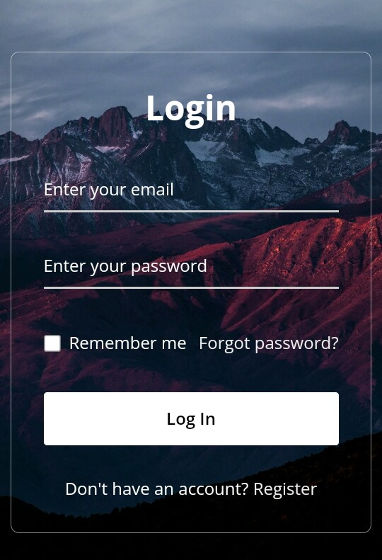
WELLCOME BACK
H
ello guys. How are you all? I hope you are all well. I came again with a post. Let’s go..

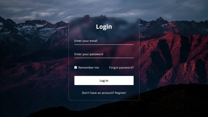
তো এই পোস্টে শেয়ার করবো সুন্দর একটি Login Form ডিজাইন। যা Glassmorphism Form। তো চলুন শুরু করা যাক।
Live Demo
Code
সব কোড একসাথে .html এ Download করুন।
index.html
<!DOCTYPE html>
<html>
<head>
  <meta charset="UTF-8">
  <meta name="viewport" content="width=device-width, initial-scale=1.0">
  <title>Glassmorphism Login Form </title>
  <link rel="stylesheet" href="style.css">
</head>
<body>
  <div class="wrapper">
    <form action="#">
      <h2>Login</h2>
        <div class="input-field">
        <input type="text" required>
        <label>Enter your email</label>
      </div>
      <div class="input-field">
        <input type="password" required>
        <label>Enter your password</label>
      </div>
      <div class="forget">
        <label for="remember">
          <input type="checkbox" id="remember">
          <p>Remember me</p>
        </label>
        <a href="#">Forgot password?</a>
      </div>
      <button type="submit">Log In</button>
      <div class="register">
        <p>Don't have an account? <a href="#">Register</a></p>
      </div>
    </form>
  </div>
</body>
</html>
style.css
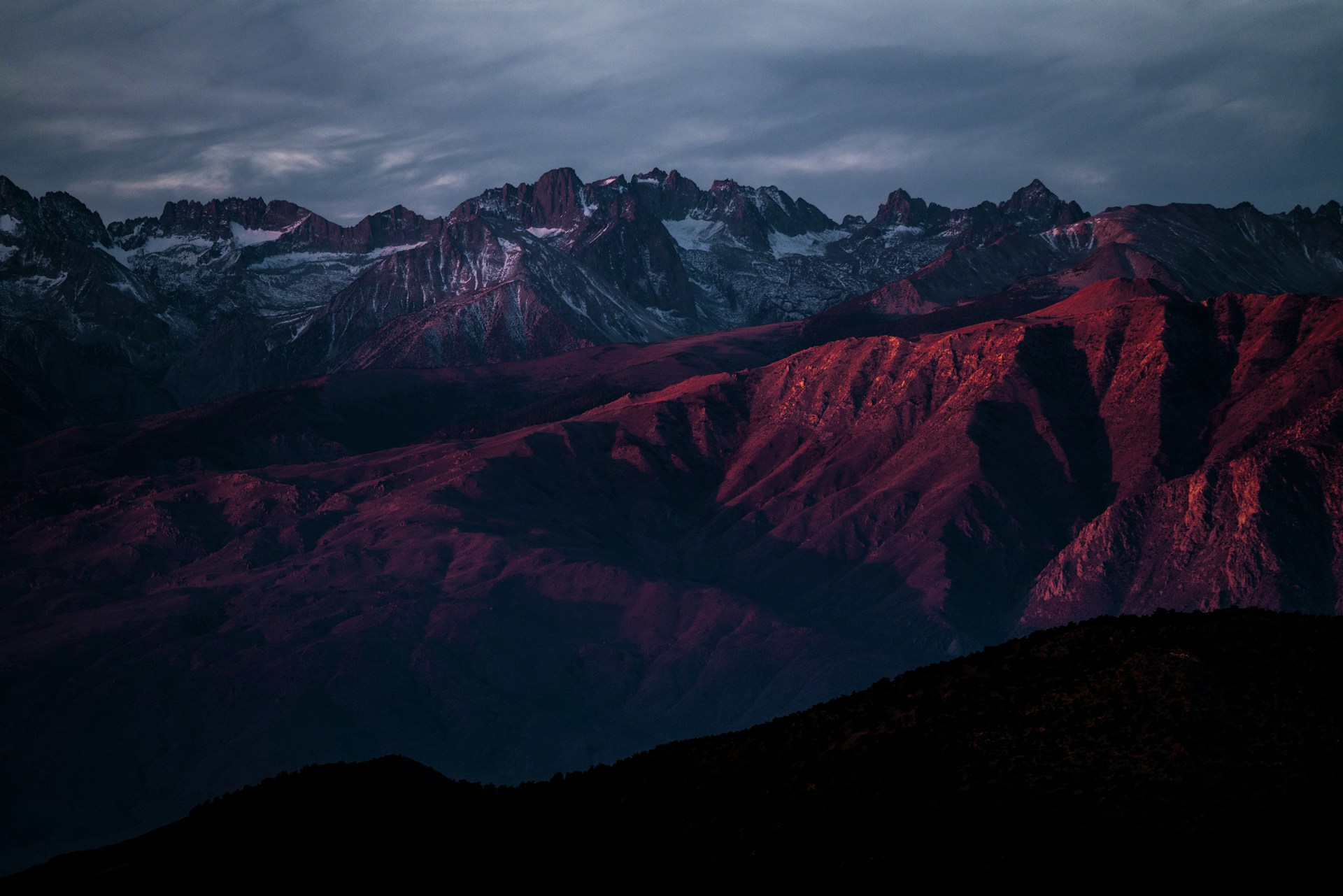
@import url("https://fonts.googleapis.com/css2?family=Open+Sans:wght@200;300;400;500;600;700&display=swap"); * { margin: 0; padding: 0; box-sizing: border-box; font-family: "Open Sans", sans-serif; } body { display: flex; align-items: center; justify-content: center; min-height: 100vh; width: 100%; padding: 0 10px; } body::before { content: ""; position: absolute; width: 100%; height: 100%; background: url("login-hero-bg.jpg"), #000; background-position: center; background-size: cover; } .wrapper { width: 400px; border-radius: 8px; padding: 30px; text-align: center; border: 1px solid rgba(255, 255, 255, 0.5); backdrop-filter: blur(8px); -webkit-backdrop-filter: blur(8px); } form { display: flex; flex-direction: column; } h2 { font-size: 2rem; margin-bottom: 20px; color: #fff; } .input-field { position: relative; border-bottom: 2px solid #ccc; margin: 15px 0; } .input-field label { position: absolute; top: 50%; left: 0; transform: translateY(-50%); color: #fff; font-size: 16px; pointer-events: none; transition: 0.15s ease; } .input-field input { width: 100%; height: 40px; background: transparent; border: none; outline: none; font-size: 16px; color: #fff; } .input-field input:focus~label, .input-field input:valid~label { font-size: 0.8rem; top: 10px; transform: translateY(-120%); } .forget { display: flex; align-items: center; justify-content: space-between; margin: 25px 0 35px 0; color: #fff; } #remember { accent-color: #fff; } .forget label { display: flex; align-items: center; } .forget label p { margin-left: 8px; } .wrapper a { color: #efefef; text-decoration: none; } .wrapper a:hover { text-decoration: underline; } button { background: #fff; color: #000; font-weight: 600; border: none; padding: 12px 20px; cursor: pointer; border-radius: 3px; font-size: 16px; border: 2px solid transparent; transition: 0.3s ease; } button:hover { color: #fff; border-color: #fff; background: rgba(255, 255, 255, 0.15); } .register { text-align: center; margin-top: 30px; color: #fff; }
আমি সব সময় কোডিং বিষয়ক পোস্ট করি তাই কোডিং নিয়ে কোনো কিছু লাগলে কমেন্ট এ বলবেন।
THE END
S
o friends, that’s it for today. See you in another post. If you like the post then like and comment. Stay tuned to Trickbd.com for any updates.